A London-based photographer in her early thirties. A decade of work that had grown steadily in quality and reach. Commercial clients in fashion and beauty. Editorial relationships with publications that mattered. A gallery show that had sold out and led to nothing, because there was nowhere for interested parties to go next.
The problem was structural. Her work existed across platforms, agencies, and contexts that shared no visual or tonal language. Her commercial portfolio and her personal work looked like they belonged to two different people — because she had never been given a framework to hold them together. Her agency bio was written by someone who had never met her. Her Instagram was a mix of finished work, process shots, and personal life that communicated everything and nothing.
She was being recommended by word of mouth for projects she was perfectly qualified for, and losing them at the research stage. People looked her up and couldn't form a clear picture of who she was.
She came to SO Studio to solve that. Not to become more visible — to become more legible.
The photographer brief carries a particular tension that other creative disciplines don't face in the same way: the person is also the practitioner. Her aesthetic is her value. Any identity system that overrode or competed with her visual language would be worse than no system at all.
The brand had to feel like an extension of how she sees — not a frame placed around it from the outside. It had to carry the same qualities as her work: restraint, precision, a refusal to explain itself.
The additional complexity was the dual audience. Commercial clients — art directors, brand managers, creative agencies — need a different signal than gallery curators or editorial picture editors. The system had to speak to both without compromising for either.
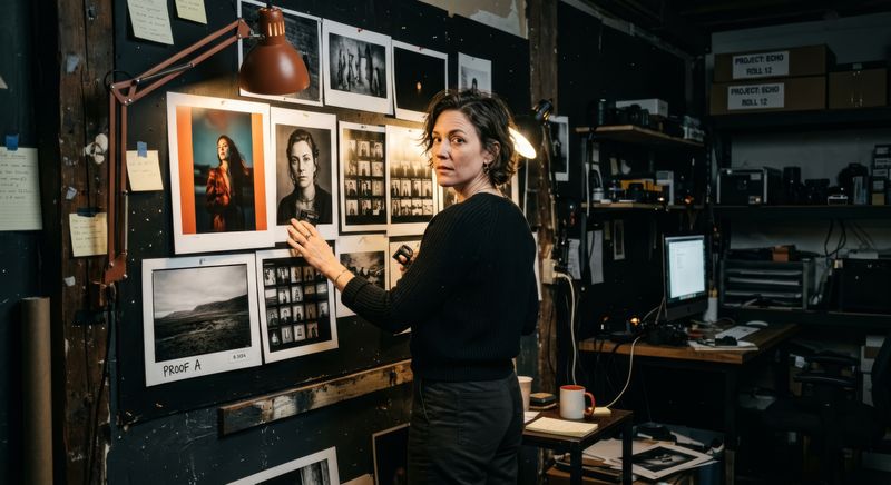
And then there was the portrait question. She is always behind the camera. We needed to put her in front of it — to give her a visual presence as a person, not just a body of work. That required a separate brief, a separate trust conversation, and a different kind of shoot.
The mark is her name in a modified serif — a historical typeface reworked at the letterform level until it felt like something she would have chosen herself. The specific decisions: slightly increased tracking, reduced contrast between thick and thin strokes, terminals left open rather than closed. It has the quality of being found rather than designed.
The colour system is narrow and deliberate. Near-black as the primary ground. A single warm off-white for contrast and breathing room. No chromatic accent — the work provides the colour. The brand's job is to get out of the way.
The supporting typography separates by register: a high-contrast editorial serif for statements and titles, a neutral grotesque for supporting copy and metadata. The combination reads as someone who thinks carefully about how things look without announcing that they do.
The guidelines cover her website, social profiles, pitch documents, exhibition materials, artist statements, and the contact templates she uses with agencies and commissioners. Every context she operates in, consistently handled.
The portrait brief was the most sensitive part of the engagement. She photographs other people for a living. Being photographed herself required a different kind of conversation — about how she wanted to be perceived, what she was willing to show, and where the line was between professional presence and personal exposure.
We shot across two days. One day at a studio in East London — controlled, precise, two lighting configurations. One day on location in an environment she chose: a working darkroom in a building she had been shooting in for years. Her territory, not ours.
The studio portraits are her primary press and commercial library. High contrast, direct, unguarded. Images that work for a Guardian Weekend profile and for an agency submission without adjustment.
The location work is different in register — more documentary, more specific, more revealing of her relationship to the physical act of making photographs. These images are for contexts where who she is matters as much as what she produces.
We delivered forty-eight final images. She approved every one before delivery. The selection process took longer than the shoot.
Her website does three jobs simultaneously, for three different visitors, without any of them feeling like they've landed in the wrong place.
For the commercial client: an immediate, curated view of her commercial and editorial work — not everything, the right things — with a direct line to her agent and a downloadable rate card. No friction between arrival and contact.
For the editorial or gallery context: a separate body of personal work, presented without commercial framing, with an artist statement written through five drafts until every word was load-bearing.
For anyone trying to understand who she is: a biography in two lengths, a selected press section, and a portrait — the one image from the shoot she chose to represent herself. One image. Chosen carefully.
The site is built for a long life. The CMS allows her to update work, press, and contact information without developer involvement. It will not need to be rebuilt when her practice evolves — it was designed to hold whatever comes next.
The first major commercial commission arrived ten weeks after launch — a campaign for a British beauty brand that had found her through the new website rather than through her agency. They cited the clarity of her portfolio presentation and the quality of her press materials as the reason they reached out directly.
Four editorial features followed in the twelve months after launch, including two publications that had not previously worked with her. In each case, the pitch was made with the new identity materials.
She has since been approached about a second gallery show. This time, there is somewhere for people to go next.