A founder and CEO in her mid-forties. Built a business from scratch over twelve years to a significant scale. Known — genuinely known — in her industry. Respected, sought out for advice, asked to speak at events she'd rather have been convening.
Outside her industry: invisible.
She was beginning to move beyond her business — advisory roles, a board seat in consideration, conversations about a fund. These opportunities required her to have a presence that preceded her into rooms she was entering for the first time. That presence did not exist.
She came to SO Studio not because she wanted to be famous. She came because the absence of a defined public identity was actively limiting what she could do next.
The executive brief is different from the athlete or the artist in one critical way: restraint is not just a stylistic preference, it is a professional requirement. For someone at this level, the brand cannot appear to be trying. The moment it looks like they've worked to build a personal brand, it costs credibility in the rooms that matter.
The system had to be impeccably executed and completely invisible as a system. It had to feel like the natural, inevitable expression of a person — not the output of a studio.
The additional challenge was range. She needed a presence that could hold in a Financial Times profile, a board-level introduction document, an investor deck biography, and a conference keynote programme. Each context has different conventions. The system had to navigate all of them without compromise.
We did not build her a logomark. A personal logo for a business leader of this calibre would be conspicuous in the wrong way — it would signal that she is building a public persona, which is precisely what her audience of peers and institutional partners would read as a warning sign.
Instead we built her a typographic system: her name in a refined, slightly condensed serif with specific spacing decisions. It functions as a wordmark without announcing itself as one. On her website, her press materials, her correspondence — it simply looks like a person who pays attention to how things look.
The colour system is minimal to the point of absence: near-white, near-black, one very dark navy that appears in specific contexts. Nothing chromatic, nothing expressive. The restraint is the statement.
Supporting typography was selected for absolute neutrality at headline level and warmth at body copy level — a combination that reads as trustworthy without being corporate.
The system was delivered with specific guidelines for each context she operates in: board papers, advisory introductions, media requests, speaking engagements, and her newsletter — a monthly note to a curated list of contacts she has been writing for four years.
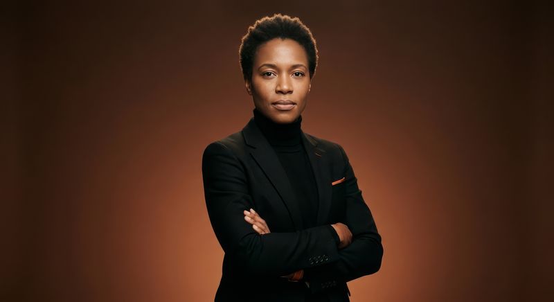
We shot in one day — four hours at a private members club in London. One location, one lighting setup, one photographer. No crew beyond what was necessary.
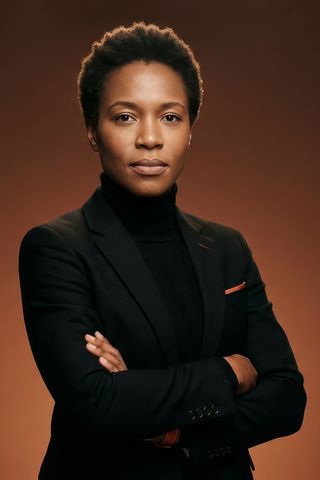
The photographs do not look like personal branding photography. That was the specific brief. They look like photographs that a quality publication commissioned because they needed an image of someone worth interviewing.
We shot in a library setting and in a corridor outside it. Both locations were available by natural light supplemented with a single reflector. The images are warm, precise, and slightly imperfect in the way that real photography is — nothing has been over-retouched. She looks like herself.
We delivered twenty-two final images. She uses eight of them actively. The others are held in reserve for contexts that have not yet arisen.
Her website is, deliberately, not a website in the conventional sense. It is a single long-scrolling page that takes approximately ninety seconds to read in full.
It opens with her name and a single positioning statement — five words. Below that: a three-paragraph biography written for an audience that includes institutional investors, journalists, and peers. Below that: her current focus areas, expressed as four short paragraphs rather than a bullet list. Below that: selected press — not a comprehensive archive, a curated selection. Below that: her newsletter sign-up and contact information.
There is no hero image at the top. Her photograph appears once, mid-page, at a scale that feels contextual rather than promotional.
The site is structured so that every section serves a specific visitor type. A journalist finds what they need in ninety seconds. An investor finds what they need in sixty. A potential advisory partner finds what they need immediately.
It loads in under a second. It requires no maintenance beyond updating the press section twice a year.
The board seat came through three months after the platform launched. We do not claim causation. We note the timing.
Her newsletter list has grown by forty per cent in the twelve months since the rebrand gave it a coherent home. Inbound speaking requests have increased in both volume and quality — she now declines more than she accepts, which is where she wanted to be.
She has referred two peers to SO Studio. Neither has been named here.