An internationally touring DJ and music producer. Fifteen years in the industry. A sound that had evolved well ahead of where most of his peers had got to. A back catalogue that warranted serious attention. Label conversations at a level that required him to present as something beyond a DJ-for-hire.
The opportunity in front of him was real: a record label imprint of his own, brand partnerships in the fashion and luxury space, a touring schedule that could command significantly higher fees if the brand matched the reputation.
The problem was visible the moment you looked him up. Every touchpoint was inconsistent. His artist name appeared in four different typefaces across different platforms. His press photos ranged from professional to phone-quality. His website had not been updated since his booking agent had built it for him as a favour.
He was leaving money and positioning on the table every single week.
The DJ and producer space has a particular visual culture — one that SO Studio had to navigate carefully rather than simply override. The aesthetic codes of electronic music are specific and earned. A brand that looked too polished, too corporate, too obviously designed would alienate the audience and the industry peers who had followed him for years.
The brand had to look like it had always existed. Like it had grown naturally from the music rather than being applied to it from the outside. And simultaneously it had to be sophisticated enough to sit alongside the fashion brands and luxury partners he was targeting.
The additional complexity: his name is his brand. As with all producers at this level, the name carries weight that no visual system can replace — but a visual system can amplify it and give it a context it currently lacked.
The mark is his artist name in a custom display typeface — a condensed grotesque with very specific weight and spacing decisions. Bold without aggression. Technical without being cold. At large scale on a stage backdrop it reads with authority. At small scale on a vinyl label it reads with precision.
We built two lockup configurations: horizontal for stage and print applications, stacked for digital and merchandise. Both use exactly the same letterforms. The system never breaks.
The colour system is genuinely minimal: black, white, and one accent — a very specific electronic-cyan that appears in limited, precise contexts. It references the visual language of the music without being derivative of it. It is the only colour in the system and it earns its place every time it appears.
Photography direction was defined as part of the identity — not as a separate brief. The system specifies the visual language for all image-making: high contrast, directional light, environments that carry atmosphere without being distracting. Consistent enough to be recognisable. Open enough that individual shoots can breathe within it.
The guidelines cover stage visuals, merchandise, press materials, digital presence, and label packaging for the imprint.
We shot across two days. One night session in an active club environment — not a performance, a specifically art-directed session in an empty venue before doors. One day session in a raw industrial space.
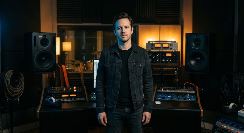
The club shoot captured what headshot photography almost never captures: the atmosphere of what he actually does. High contrast. Deep shadows. The physical relationship between a person and an environment built entirely around sound. These images are unlike anything in his existing press library — and unlike the press images of most of his peers.
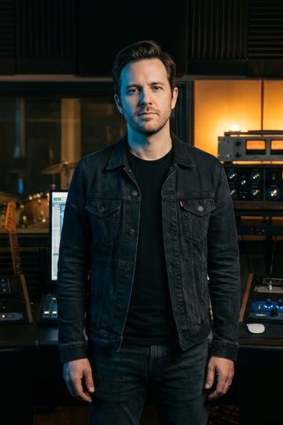
The industrial day session produced his primary press portrait series. Controlled, authoritative, directional. Images that work for broadsheet profiles, for booking pack covers, for the fashion editorial contexts he is moving into.
We delivered fifty-one final images. The club photographs immediately became the primary visual across his social platforms. Three were used in a fashion brand's campaign without further art direction required — they already fit.
His website is a single-page experience built for two audiences: industry professionals and fans who are already deeply invested.
The experience opens with his name, large, over a slow-moving atmospheric image — not a video, an image with motion applied in post. Sound is off by default. The motion creates atmosphere without demanding attention.
Below: a biography in two lengths. A music section showing the latest releases with streaming links. A live section showing upcoming dates with booking contact. A press section with downloadable assets and selected coverage. A label section for the imprint — minimal, with contact for A&R and licensing.
The design is high contrast, typographically driven, fast. It does not try to replicate the experience of his music. It creates the right environment for someone to form a view of who he is and what they want from him.
The first fashion brand partnership was signed within ten weeks of launch — a campaign that had been in discussion for four months prior but had not progressed. The creative director cited visual alignment as the reason it moved forward.
Booking fees for his headline shows increased in the first renewal cycle following the rebrand. His agent cited the brand presentation as part of the negotiation context.
The label imprint launched six months after the rebrand. The identity system was already in place to receive it.