A professional footballer with over a decade at the top of the English game. Forty thousand Instagram followers. A genuine public profile. Zero brand infrastructure behind it.
He had two years left on his contract and a clear-eyed view of what came next — business ventures, media, commercial partnerships. The problem was that nothing about his online presence communicated any of that. His logo was a crest-style mark a friend had made him years ago. His website was three pages of statistics and a contact form. His photography was match-day press shots and gym selfies.
The managers and brand partnerships executives he was being introduced to were forming an opinion before he walked in the room. The opinion wasn't good enough.
He came to SO Studio with one ask: make me look like what I actually am.
The challenge with athletes at this career stage is specificity. A generic "professional, accomplished, driven" identity helps no one. It describes every athlete. The brief required something much sharper — a visual and tonal language that communicated his actual ambitions, not just his athletic history.
He wasn't trying to be a lifestyle influencer. He wasn't building a clothing brand. He was positioning himself as a serious commercial entity — someone brands could put their name next to and feel elevated, not just reach.
That required a brand that felt authoritative, restrained, and deliberately adult. Not aspirational in the conventional athletic sense. Something closer to what a well-regarded private equity partner might carry — except with the visual tension and energy of someone who had spent their career performing under pressure in front of fifty thousand people.
We built the system around a single wordmark — his initials, rendered in a modified serif with extreme weight contrast. No crest. No laurels. No motion lines. The mark works at any size, in any context, from a press release header to an embroidered detail on a jacket.
The colour system is deliberately narrow. Near-black as the primary ground. A single warm off-white for contrast. One accent — a deep, muted bronze that references quality without announcing itself. The palette reads serious at a glance and rewards attention on closer inspection.
Typography is structured and hierarchical. A condensed display face for statements and headlines. A neutral grotesque for body copy and supporting information. No decorative fonts, no casual weights.
The guidelines document runs to sixteen pages. It covers every application: social profiles, media kit, press releases, email correspondence, presentation decks, merchandise. Any context he walks into, the brand holds.
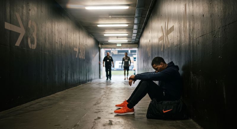
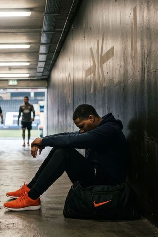
We shot over two days — one studio session and one location day across two sites in London.
The studio work focused on portrait: tight, controlled, purposeful. Lit with a single large source modified to near-daylight quality. The goal was images that could sit in a Financial Times profile or an Arena Homme feature without looking out of place in either. Not athletic portraits. Portraits of a man with presence.
The location day was looser — architectural environments, available light, a wider editorial frame. These images carry the movement and energy that the studio work deliberately withholds. Together the two bodies of work give him a complete visual library: formal contexts, editorial contexts, social contexts.
We delivered forty-seven final images. He has not needed a reshoot since.
The website does one job: it tells you, in the first eight seconds, exactly who this person is and why that matters to you.
The homepage opens on a full-bleed portrait. His name. A single line of positioning copy. Below that: a brief biography written in the third person at a level appropriate for a serious press context. Then: commercial interests and partnership categories. Then: a concise media section — selected press, a downloadable media kit, a contact form that routes to his management.
No match statistics. No career timeline. No fan content. That information exists elsewhere. This platform is for people who already know who he is and are deciding whether to work with him.
The site is built for performance and longevity. It loads in under two seconds. It is fully responsive. The CMS allows him to update press entries and partnership information without developer involvement.
Within six weeks of the platform going live he had received three inbound enquiries from brand partnership teams at companies he had specifically targeted. One became a signed deal.
His management team now send the website URL as the first touchpoint in every introduction. It does the work of the first meeting before the first meeting happens.